Foundations of Color
Color Harmonies

Neutral Palette Studies
Core Essence: The ultimate achromatic neutral that bridges the gap between black and white to represent balance, nuance, and sophisticated maturity.
Psychology & Influence: Unemotional, detached, and unbiased, providing a calming influence that can shift from conservative and dignified to sleek and modern.
Design Versatility: A highly adaptable backdrop that can either mute or enhance a palette, pairing with pale pigments for calm aesthetics or deep hues for gentle energy.
Professional Identity: Heavily associated with urban environments, intellect, and corporate prestige, signaling authority, wisdom, and high-end formality.
Silver Grey

Core Essence: An earthy mix of gray and brown that bridges cool and warm undertones, appearing effortlessly across both indoor and outdoor spaces.
Psychology & Influence: Evokes understated sophistication, balance, and relaxation, serving as a primary signature shade for the "quiet luxury" aesthetic.
Design Versatility: A highly dependable, unassuming neutral that adds subtlety, grounds intense or overstimulating colors, and pairs seamlessly with dark or light shades of brown.
Color Harmonization: Blends beautifully across a wide color spectrum, harmonizing effortlessly with white, gray, green, ochre, blush pink, and its complementary wheel partner, blue.
Taupe
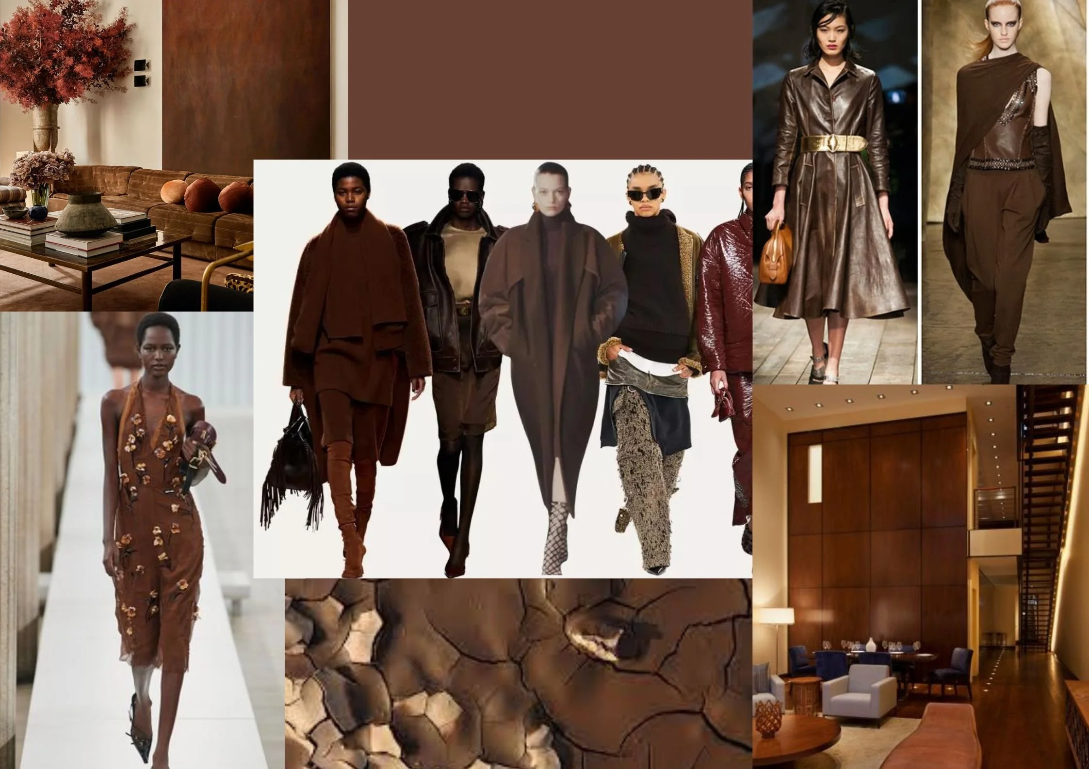
Core Meaning: A grounding color rooted in nature, symbolizing earth, soil, and bark.
Psychology: Evokes warmth, stability, resilience, and comfort.
Branding Value: Communicates dependability and sustainability for brands like UPS and Hershey's.
Versatility: Pairs with green for an organic feel, pink for a chic style, or white for a clean look.